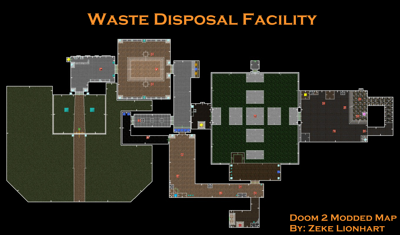
Doom Map: UAC Waste Disposal Facility
WDF: Postmortem
How it started
A few years ago when I started studying more deeply about level design, a couple of texts stood out to me, especially an article titled A Beginner's Guide to Designing Video Game Levels, by Mike Stout. I've always been fond of learning things through a step-by-step approach, so this tutorial stood out to me - I had already learned a lot of theories and concepts but this article gave me the practical steps I needed to continue improving. After a few attempts without much direction, I noticed I needed a specific game to create a map for - and Doom was my choice.
Having grown up with the franchise and being very familiar with its peculiarities, Doom seemed like a great starting point. Developed by id Software and released in 1993, Doom is one of the grandfathers of the FPS genre, paving the way for other classics such as Quake and Half-Life to continue building upon. Doom is full of great examples of level design, with short and intricate maps, full of secrets and challenges. Along with its simplicity, this game felt like the perfect starting point.
So that I did, I got some random free CAD program, designed a map, and was fine with it. But now I realize my portfolio lacks examples of level design, and when I stumbled upon the Ultimate Doom Builder software, I decided to bring back that old map and actually build it in Doom itself.
What I had

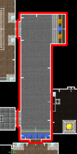
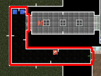
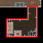
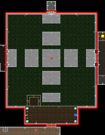
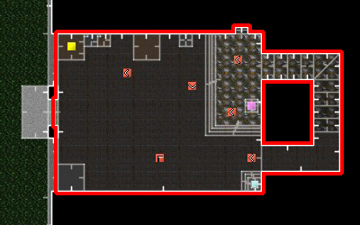
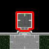
As per the article, I had done a simple bubble diagram to get the main flow and layout of the level: a linear map with safe rooms to break down the pacing. In retrospect, there was a lot I could do to make this diagram more clear, but in short, there are two safezones (S1 and S2) breaking apart 3 escalating teaching/combat sections (rooms 1-2-3, 4-5-6, and 7-8. More details in the documentation). A secret room (SS) would be teased early on, prompting the player to scour the map to find it, and by the end a locked exit door would need the red keycard to be opened, teaching about the keycard mechanic. And so, this was the final design:

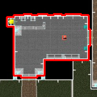
This map was the final result of that process. Coming back to it, this is what I took and started building in Ultimate Doom Builder.
What I did
Still unfamiliar with UDB, I made a 1:1 replica of the map I had done in the past, with some minimal adjustments since I had no idea how Doom levels were made when I designed this map - things such as how walls need to have some width to them. But what was possibly the most challenging part was introducing a new aspect of the plan: narrative coherence. Now that I was actually creating a "physical" version of this map, I wanted it to look like a place that could exist, a place with a purpose, with a story behind it, unlike the previous iteration which was just a simple map with no personality.
In hindsight, this was probably my greatest mistake in this project. The original map was not ready for this kind of upgrade in scope, and trying to add more to it limited the design possibilities, which resulted in most of the map's shortcomings, even though there weren't many. Still, by the very end, this is what I got:

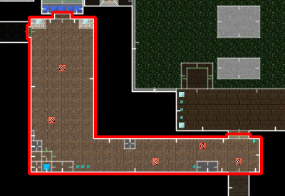
There are so many changes to unpack here that I will do so room by room, addressing which changes I realize I had to make, which I did to make the room look good, which were results from playtesters feedbacks, and the lessons I've learned along the way.
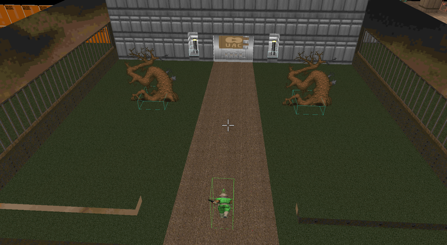
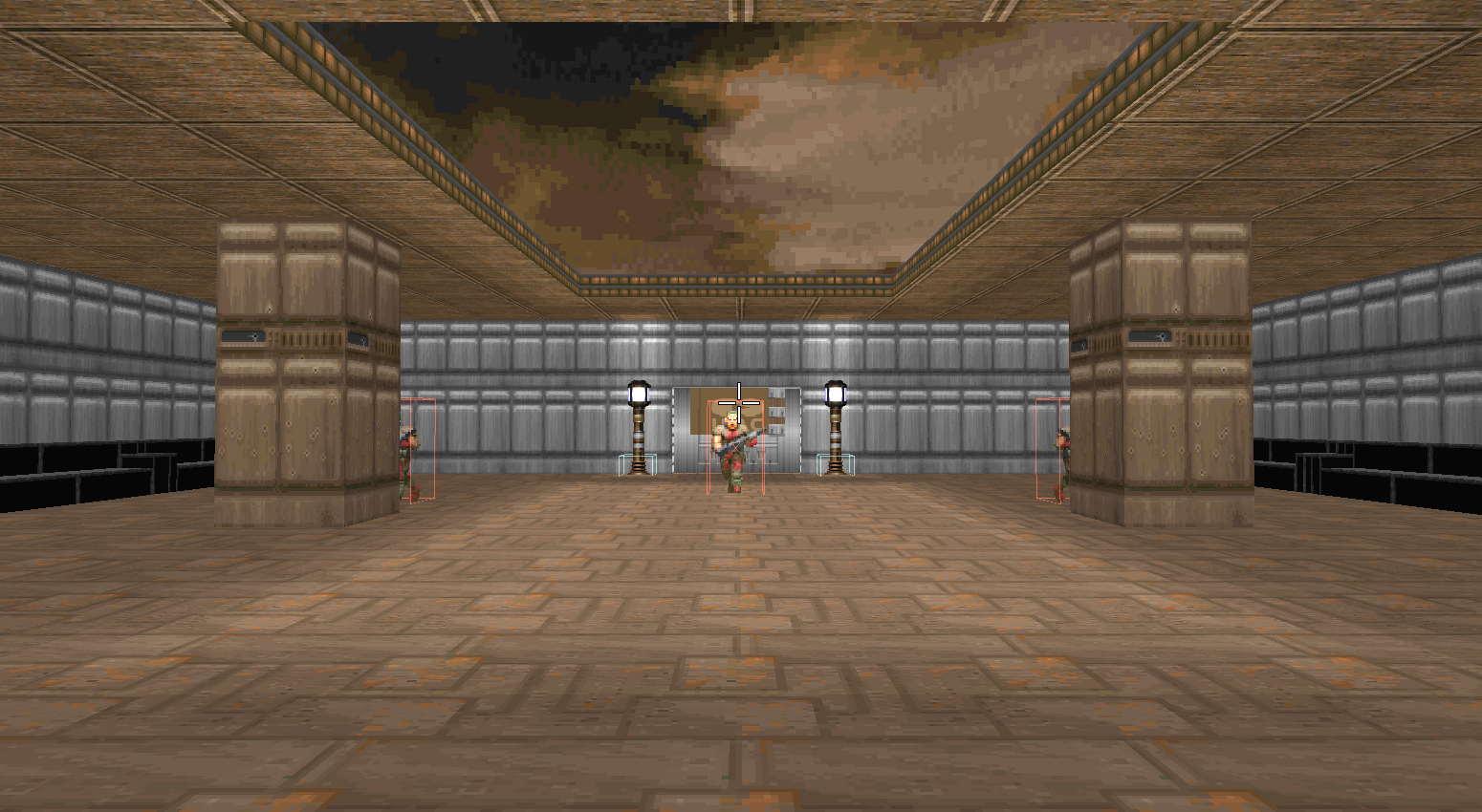
Room 1: The Entrance
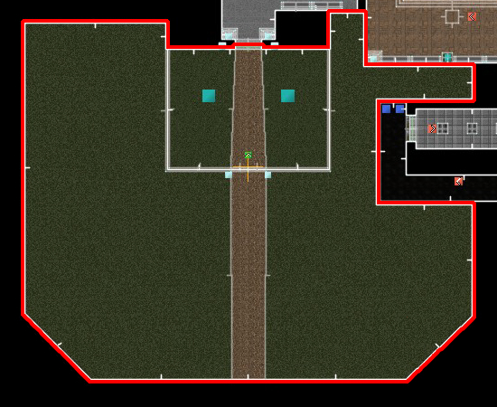
This is the entrance of the map, and little changed from the original plan. After deciding what this map was supposed to represent, it made sense to have this first room be an external area, the entrance to the facility. While the playable section remained the same, I added an external area beyond it to give the player a sense of a larger world outside this map.
This first room is supposed to be a safe area, with no enemies in sight, where the player can get used to the game's controls - so it is spacious and with a couple of obstacles. It was also supposed to be where the player learns how to pick up items, as the game's first weapon, the pistol, was supposed to be placed by the door, causing the player to pick it up as they investigate the entrance. Unfortunately, in Doom the player necessarily starts with the pistol, and there is no option to take it away and give it as a pick-up. This plan to teach picking items up was then scrapped since I also found out playtesters, even those unfamiliar with the game, didn't take long before they realized by themselves they could pick up items by walking over them.
Room 2: Reception Area
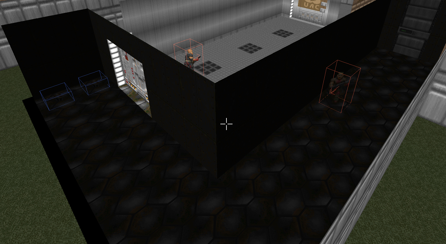
This next room had no changes at all, only additions. The purpose of room 2 is to introduce the player to their first enemy, and this also did not change. A "Former Human", the most basic enemy in the game, stands around the corner, alone, waiting for the player to show up. Since this kind is weak, it doesn't offer much resistance and serves its purpose perfectly.
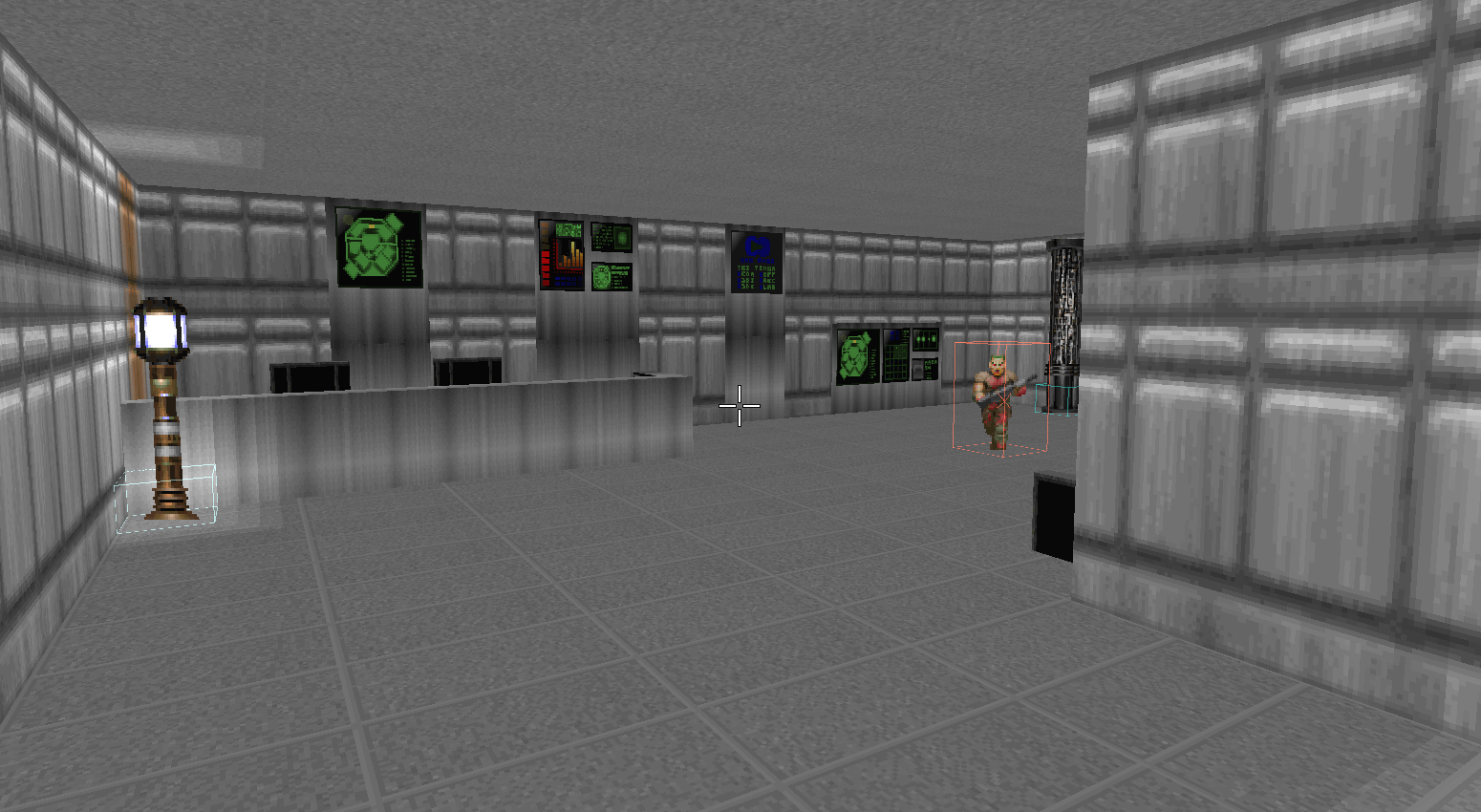
Since the previous room was the outside of the facility, it just made sense that this room was the reception area. I wanted this place to have a pristine and sterile look, as a contrast to how it gets rougher deeper in, and the silver textures served this purpose well. This is also where I tried making chairs and benches for the first time, something I used in many other places later on. A challenge here was properly conveying what this room was. After I got the desk and chairs in place, the room still felt too empty, and I think that the computer screens on the far wall helped with that. All playtesters got the right feeling from the place, so I call that a success.
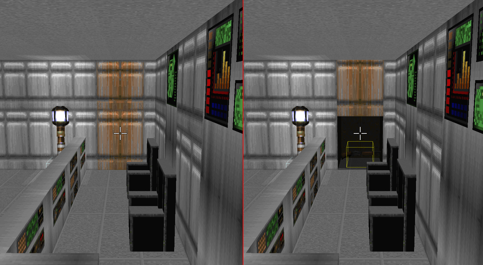
One small addition and arguably failure was the secret door behind the desk. While I was halfway through the creation of the map, I realized it had too few secrets around the map - only 1, when the average Doom level has about 4. Because of this, I came back to many different spots around the map spreading secrets where there were no plans to add them. Because of this, there is barely any progression to them, and especially this one above was bad.
This secret was supposed to be like a secret compartment where the receptionist kept a gun to deter invaders. I used a different texture to distinguish this section of the wall from the rest, calling attention to it like Doom does so often. The problem is that I had already made too many different wall sections in this room (the computer screens on the wall), drawing attention away from the secret - not to mention how this one is hidden in the corner from the perspective of the player who first entered the room. All of these small issues resulted in this being by far the secret every single playtester took the longest to find.
While it is true that there are some tough secrets in Doom that take long to find, I think this one is probably way harder than the others, so if I ever were to come back to this map, I'd probably change or remove this one.
Room 3: Courtyard
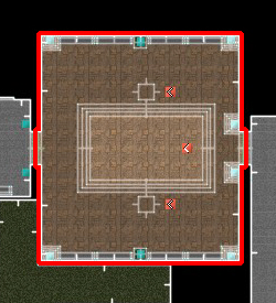
While looking for tutorials online to learn how to make outdoor areas for room 1, I came across a video that teaches how to make open ceilings - and I knew I just had to use it somewhere. And so, room 3 became a courtyard. It made the most sense out of all the other rooms, as this one was big, already had two pillars, and would make sense as a gathering/time-off room after the reception area. All in all, I'm pretty happy with how it turned out.
Gameplay-wise, it is here that the player learns how to deal with multiple enemies, after having dealt with a single one. The pillars here were meant to serve as cover while the player zooms around, and it did indeed serve that purpose, but during playtest that proved to make this room way too easy. So a small change entered the scene: I added a third enemy and hid the other two behind each pillar. This upped the difficulty a little bit more, while also often pushing players to reposition to keep some enemies out of vision.
Safe room 1: The Corridor
As the first safe room, the corridor serves as a break on the flow of the map, where the player doesn't need to worry about enemies, and can rest and recover. But this is a room I'm not so happy with. While there's nothing functionally wrong with it, it just didn't turn out as I wanted it to. It was supposed to be the entrance to the more "underground" side of the facility, but it ended up pretty generic.
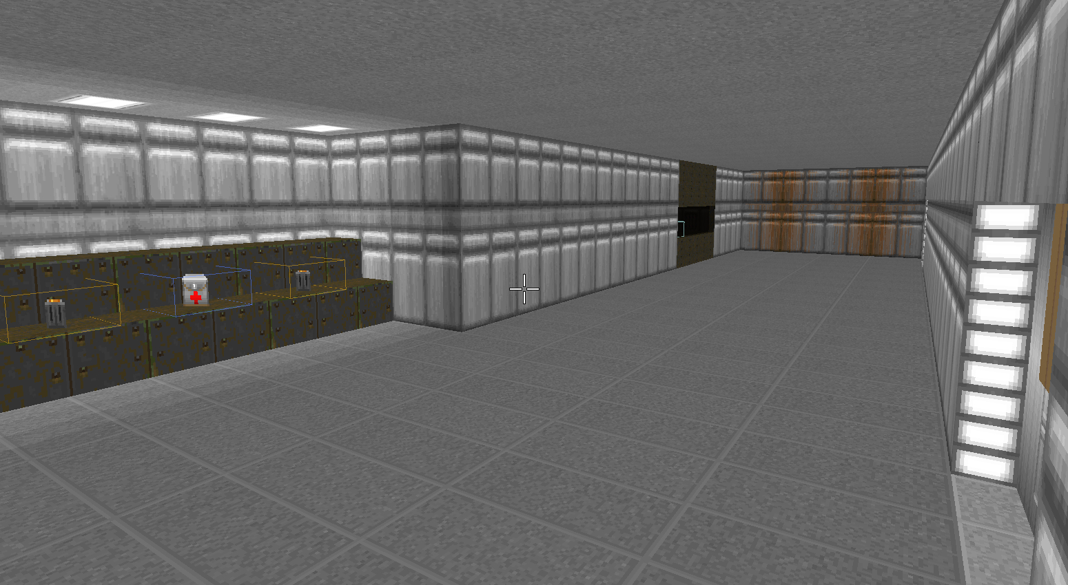
For instance, the steps where the medkit and ammo are, I wanted them to be like weapon stands, where staff put down their guns before entering the danger zone - but no matter what I did, it just didn't look right. Other decorations either felt out of place, blocked vision of important stuff, or diverted attention from where I wanted to draw to. So I just left it how it is. It's not bad, but not good either.
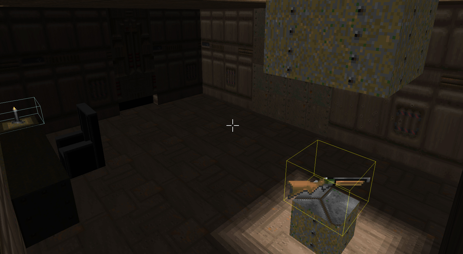
Still, the most important stuff in this room is up ahead, by the end of the corridor. Here, there are two secrets, one on the left, which was part of the original design, and one on the far end, which is supposed to teach how secret doors work. Yes, after room 1 which already had a secret door. Oops. Anyway...
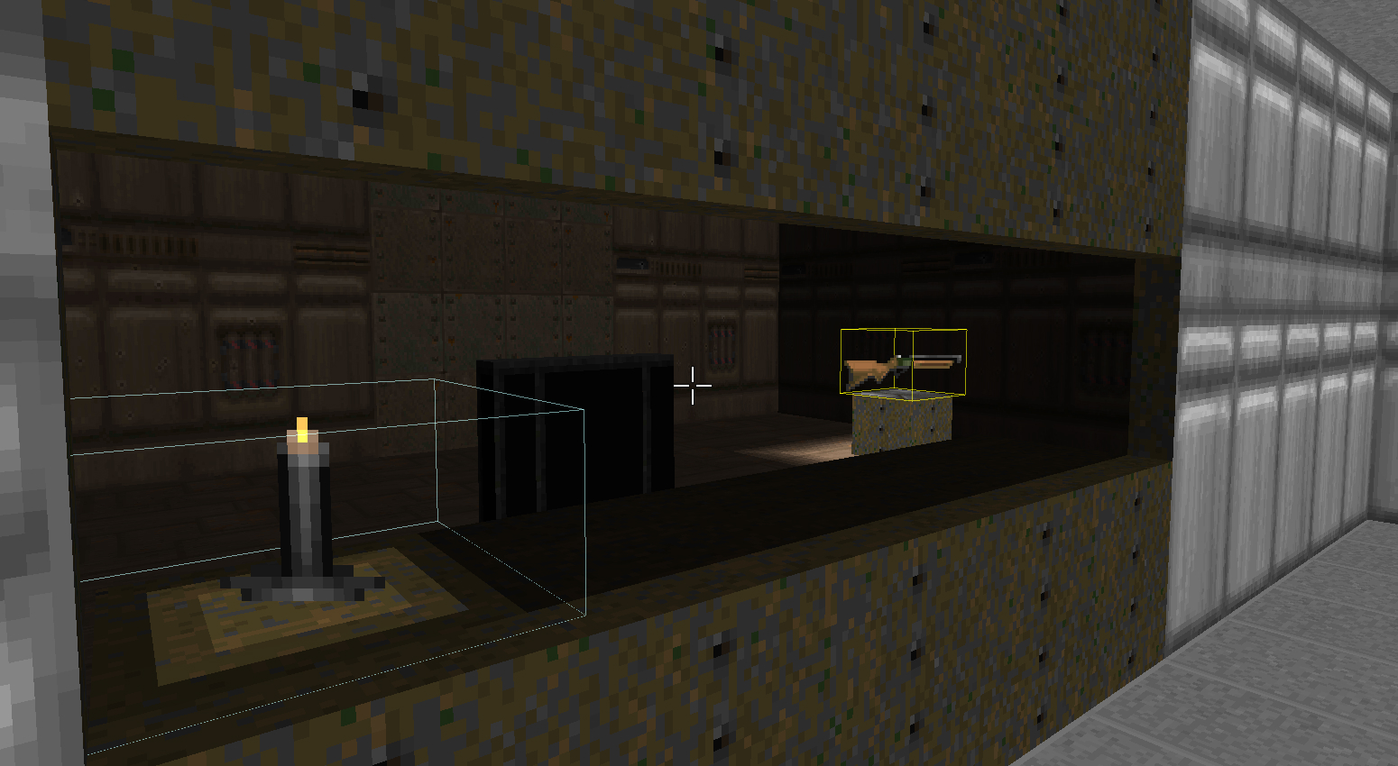
There were some small changes to this side of the room, specifically the position of the Super Shotgun and the window/opening. Moving the former to the south of the room and the latter to the northern end, both align better to allow the player to see the gun from earlier in the corridor, even better when paired with the lighting on the shotgun. I decorated this secret room as a security checkpoint of sorts, since from this spot on, we're entering the danger zone of the facility.
Or we would, had the floor not collapsed! While trying to assign a purpose for each room, the detour on the next 2 rooms didn't feel at all natural - instead, it would make more sense if this room connected directly to room 6. So the plan was to justify a forced roundabout path due to the main route being blocked. Unfortunately, this wasn't communicated very clearly here, be it for my lack of creativity or UDB's lack of textures and flexibility.
In any case, the idea was that after an accident a collapse happened, which prompted the staff to seal and hide the way with a new wall (which is gameplay-wise a secret door). There is more to it, but I'll come back to this secret in room 6.
Room 4: Decontamination
Again, due to either my lack of creativity or the engine's lack of textures, this room didn't turn out as I wanted. This is a side passage into the area of the facility that suffered from an accident, and so this is a decontamination zone. But it doesn't look like one. Well, at least no one was able to immediately tell that it was so.
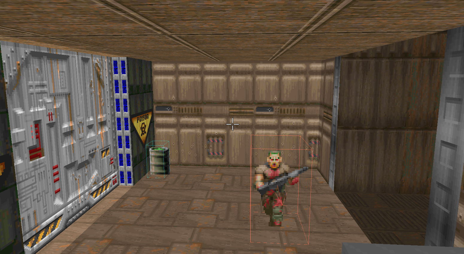
This room's purpose is very straightforward: introducing the Former Sergeant. This type of enemy is very similar to the Former Human used so far, but he carries a shotgun - which means he deals a lot of damage up close but little damage from far away. This is why this room is long and the enemy is placed by the far side, so that this first encounter is not too punishing.
Room 5: Side Passage
After decontamination, the player is led by a side passage back into the main path, on the other side of the collapse. This used to be a "behind the scenes", maintenance-only passage before the accident, which is why it looks much less presentable than the rest of the facility.
The room was a tough one. The original plan was to have a room in which the player faces a Former Sergeant close-up, teaching them the value of keeping their distance. The problem was that I couldn't do that in any satisfactory way. First, the problem was that the shotgun guy was dealing way too much damage, unjustly punishing the player for turning the corner. Push the enemy farther away, and the lesson isn't taught. Make it not face the player's direction and they can be sneaked upon before shooting and teaching the intended lesson. It just wasn't working, so I decided to scrap that plan, change the enemy for a safer Former Human, and darken the room to change the pacing a little. Also added a couple of armor pick-ups to introduce the item to those who are minimally thorough.
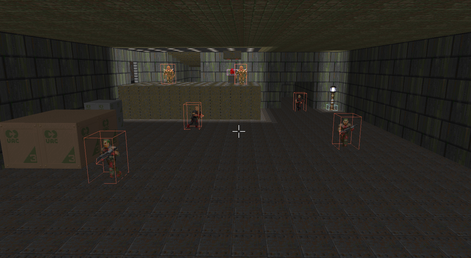
Room 6: Cargo Passage
And here is the last challenge of the second section of this map. This is the room that has suffered the greatest number of changes compared to the others. Some of these changes were to give this room a theme, but the main reason was to allow for a better entry angle in room 7, which I will explain better later on.
This passage leads to the facility's waste disposal room, so it is where most of the cargo passes through - some of them being left a while in a corner, waiting for their turn to be disposed of. This first half had but a few small additions from the original plan. The core idea of a long and wide corridor remains, with two shotgun guys barring the way.

One noticeable change is the northern wall, which is now the other side of the collapsed ceiling. This wall has a small horizontal slit through which the player can see there is a small room on the other side, prompting them to look for a way to get in (a secret door in "the corridor" room, indicated by the different wall texture). At first, I thought about making the slit on the other side and the secret door on this wall so that the player can see a hint of the secret first, and then go and find it without needing to go back to a previous room. There are two reasons that made me pick this way instead: first, that would ruin the feeling I was going for, as I wanted the collapse to be hidden as if UAC was keeping their secrets behind closed doors (literally). Secondly, I'd have repeated the same secret, one next to the other - the corridor room would have two "windows" showing secrets behind hidden doors. It just didn't feel right to me, and I don't regret doing it this way as no playtester had any major issues picking up on this secret.
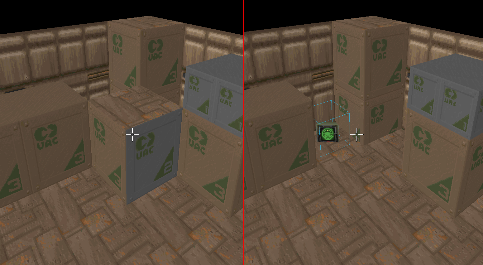
Another change is a new secret that lies at the end of this first corridor. This wouldn't have existed if not for the playtesters. While exploring for secrets, some of them really fixated on these boxes. I needed to add more secrets to the map and this really seemed like a good spot for one.
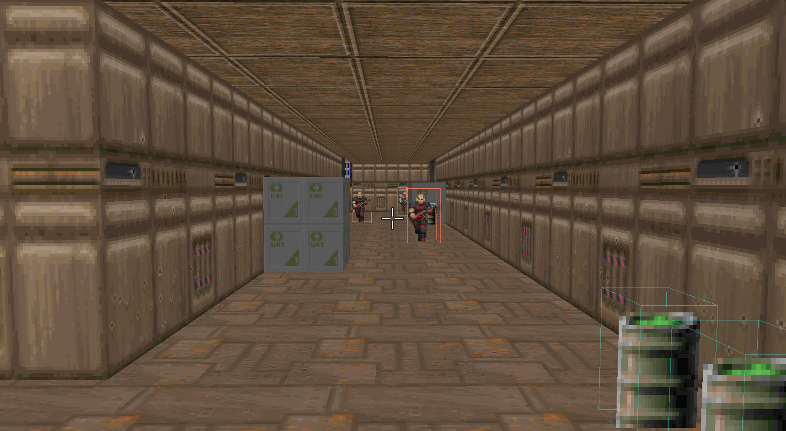
The biggest change to this room is the addition of this next corridor, turning left at the end of the first one. As previously mentioned, the sole reason for this extra section was to allow the player to enter room 7 from a different angle, allowing for a better view of an upcoming secret, which I'll address later. I took the opportunity to lengthen the combat in this room, adding three new enemies with some cover to encourage better positioning. As an extra, I realized this was the best place to spread some explosive barrels, as the shape of the room allows for some opportunity to accidentally shoot them if the player didn't do so on the previous ones - or for the enemies to shoot the ones by the player's side. Either way, lesson learned! All in all, I think this corridor really made the overall experience better as it lengthened room 6's combat section. I feel like the original plan's encounters were way too short for my taste, which also motivated another change further on.
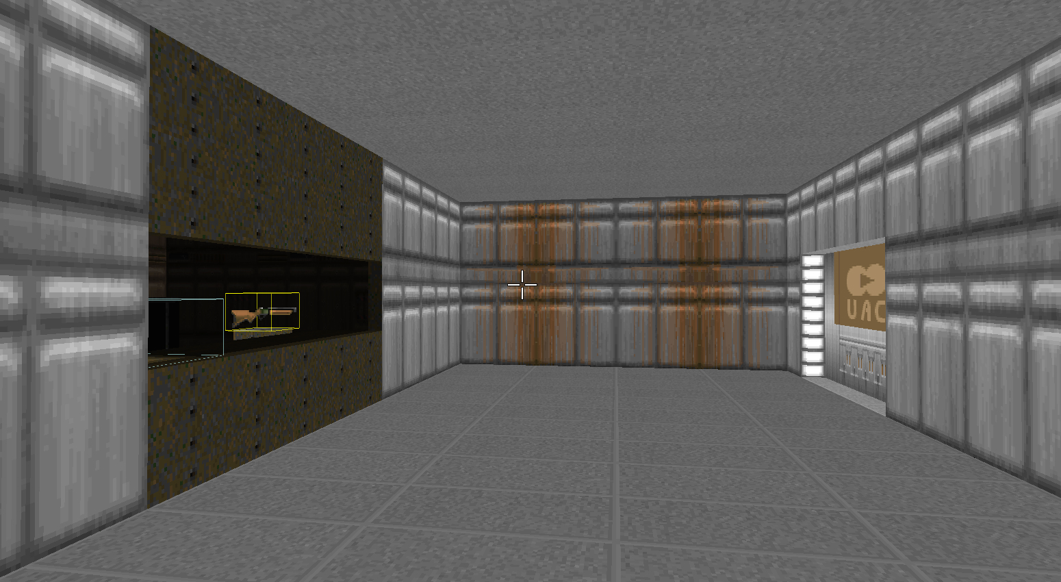
Finally, by the far side of this corridor lies two doors: right to the next safe room to break up the pacing, and left to the next main room, now a locked blue door. During the first few playtests, I noticed players weren't learning from rooms 7 and 8 how keycards and locked doors work and were completing the challenge by accident. As I was already too deep into the level's development (I certainly should have had someone playtest it sooner!), instead of changing the map's layout to better suit the lesson I wanted to teach, I decided to hand a similar problem to the player earlier in a more straightforward manner - and this is how I locked the door to the left.
The intention here was to highlight the left door to encourage the player to try and open it first and learn that it is locked. Then, they would go to the dark room on the right to find the blue keycard. Since they are so close together, it should be clear that one opens the other. And this indeed worked... most of the time. A few playtesters didn't go for the blue door first since it felt more like a continuation of the map than the room to the left, and others were so caught up on the next secret (more about it later) that they didn't even think much about the door. So while this mostly solved the issue, I think this is something I'd pay more attention to next time, as something that requires a little different approach to increase the rate of success in conveying the desired lesson. I'd probably move a couple of rooms and definitely not involve another puzzle in the same place to avoid distractions from what I want to teach.
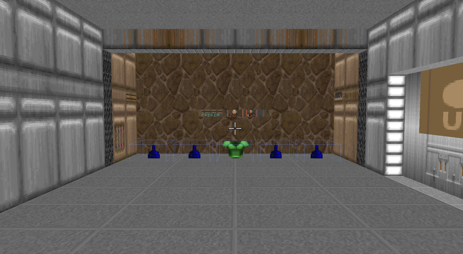
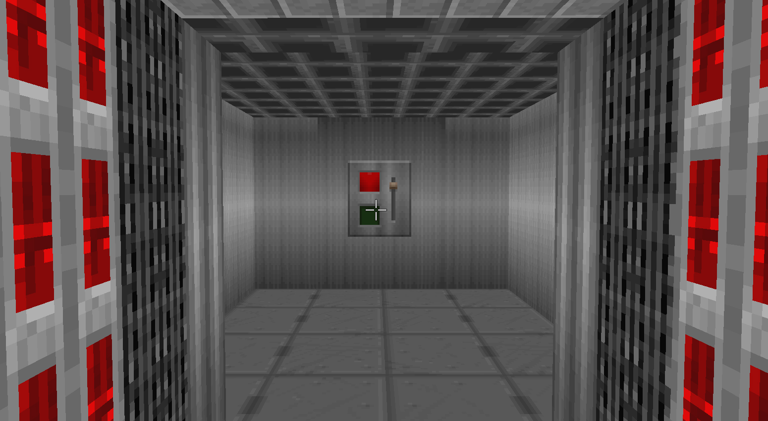
Safe room 2: Small storage room
Breaking the second and third sections of the map, this storage room offers a little rest after the previous room's intense encounter. This is probably the room I'm most unhappy with. I don't think it's bad or anything, but it could have done much more to the level's design than it's doing as is.
This room existed for two reasons: to have a button for the level's secret (one of them, as of now), and to offer healing items. Since ammo seemed to be plenty, I removed them from the next room and moved the healing item to it, leaving the button and the keycard here. As stated before, these two just don't work together, as the button distracts the players from the keycard and the locked door. Then, there's the fact that this room is too small - the player doesn't spend too much time here before proceeding, so it's hardly a break in a chain of encounters. But the biggest problem is the button, which taught me an important lesson about secrets.
Every single one of the playtesters had a problem here. All of them pressed the button, wondered what it did, and went back in the level to search for what changed. Some of them spent more than 5 minutes just running around trying to understand what this button did. This button opens the secret door to the Super Shotgun room the player had already seen into, but to realize that the player must advance in the level, and I never expected that their first instinct was to go back. Though, in hindsight, it does make a lot of sense.
If I were to go back to editing this map, I'd scrap this entire room. I'd make it larger to allow for a longer break, and probably extend the player's time here with a labyrinth-esque layout with crates and more items. Then, I'd move the button to room 8, where there would be no way for players to search for the secret door in the wrong direction.
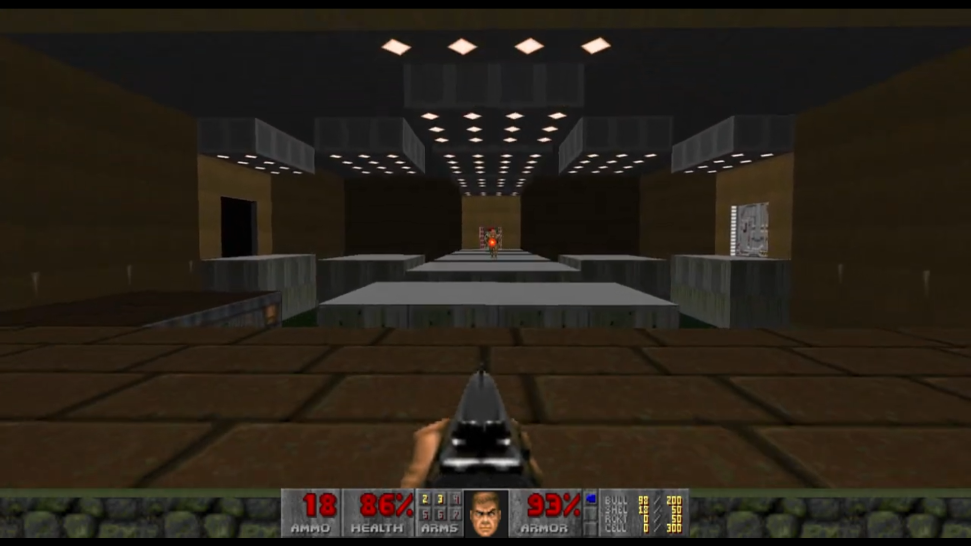
Room 7: Waste disposal
Finally, the star of the show, the room that dictated the name and theme of the map: the waste disposal room. From the first draft I had done, being as big of a room as it was and needing a hazardous floor, it just made sense that this room would be used to dispose of radioactive waste, and then the rest followed. This room had three goals: introduce the Imp enemy, provide a platforming challenge, and hide the level's (main) secret.
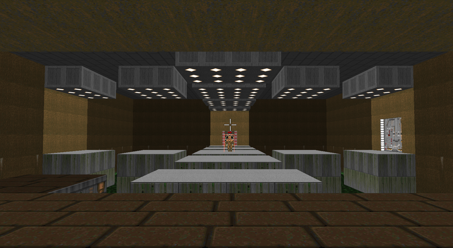
Unlike other enemy types introduced so far, the Imp's shots aren't hitscan - they can be dodged. It just made sense that the best way to introduce this mechanic was to have them first appear far away from the player, somewhere they can't reach easily, forcing them to notice the low projectile and try dodging. This matched perfectly with the platforming challenge I wanted to have in this map, and during the playtests this did work exactly as I wanted. Also, I think it turned out looking pretty cool.
It also remained mostly like the original design, with just a few, minimal changes to better direct players and fit Doom's limitations. As an example, while you can adjust wall textures, there is no way to move floor and ceiling ones. This means that I had to enlarge the gap between platforms since 1 unit was too small that the player could just walk through them, and had to readjust the platforms' sizes so that the ceiling textures aligned properly.
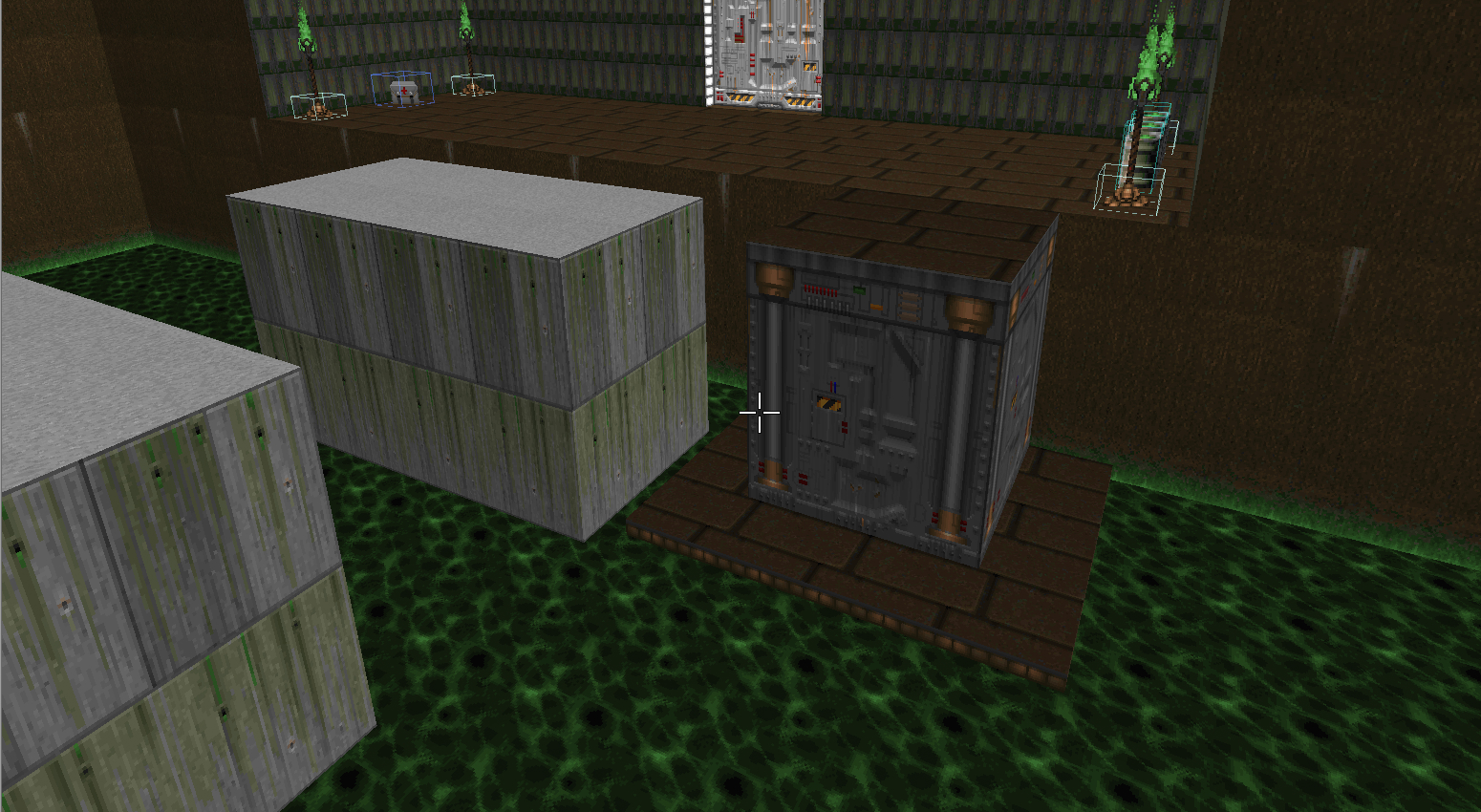
As to not punish the player too harshly for falling, I had an elevator planned that could take the player back to the beginning of the room. The thing is... As a Doom veteran, I just slapped an elevator texture on it and called it a day. The problem? New players had no idea walls with that texture are elevators and can be interacted with. Oops! To address this, I added a tiny strip of floor around the elevator to attract players to seek safety there, and in turn, end up interacting with the elevator while trying to figure out how to proceed. It worked.

The reason room 6 was changed was to allow this angle above to be the angle the player enters this room. Unlike the original entrance, the player can see the secret door open when they enter from here after pressing the button, giving the necessary hint to what the button does. This, of course, is a timed challenge, meaning the player needs to press the button and run through the platforms to reach the secret room in time.
Secret Room: Checkpoint
Finally going all the way around, we've arrived at the secret room containing the Super Shotgun. As the level was taking shape and the theme was settled, a small room with an open window to an earlier corridor instantly evoked the idea of a checkpoint room, so I ran with it.
While this room is pretty simple and some of it was already mentioned before, there are a couple of things worth mentioning here. Since the door to this room is on a timer, this means that once the player gets in, the door will close behind them, trapping them inside. If I removed the timer to keep the door from closing, the entire secret would be ruined. Maybe there was a smart way to make the door stay open once the player crosses it, but since I couldn't figure that out, I've opted to change the inside of the door to indicate it can be opened from that side. While playtesters were confused for a brief moment, it worked just fine.
The other thing was a fake door I included here. While decorating this room, I realized that it didn't make practical sense if the only way into the checkpoint room for the people working here was through a secret door that goes into the radiation pit. For this reason, I wanted to include a door here, but since there was no point in using the door, I made it a fake one. To indicate so, I avoided using all signs I've been using to indicate doors. This one has no lights, it's not contained in an alcove, and is slightly open, as to indicate it's stuck. In practice, most playtesters tried interacting with the fake door but didn't insist for too long. While I'd personally liked it better if the testers were more dismissive of the fake door, I suppose that is to be expected since they were stuck inside a dark room trying to find their way out.
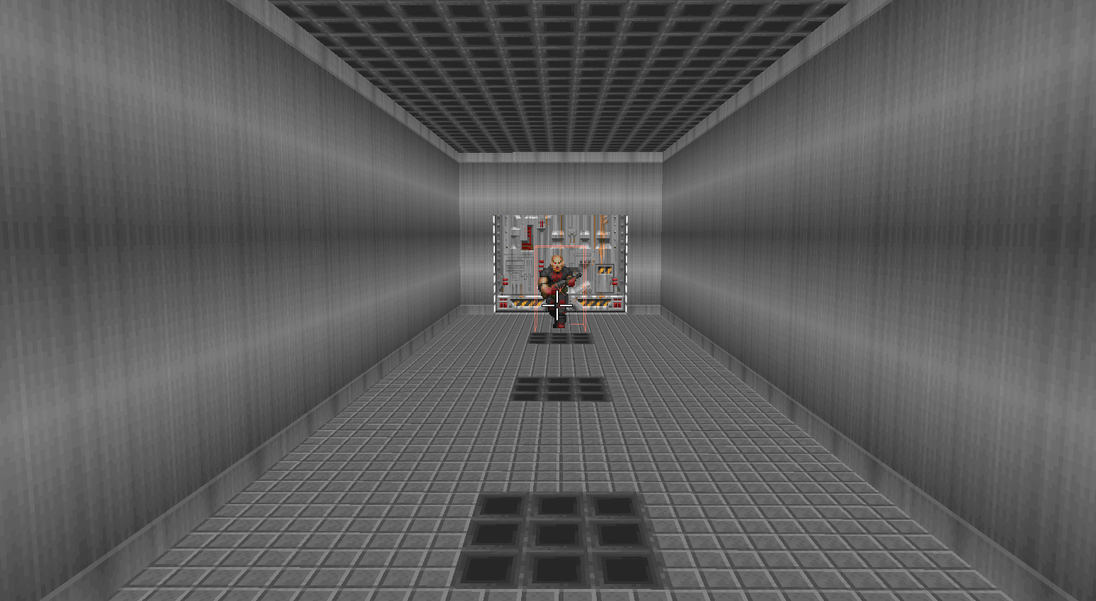
Room 8: Large storage room
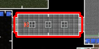
Into the final challenge, this large room holds the highest number of enemies in any encounters so far, and all 3 types as well. I was running out of ideas at this point, and this room's odd shape was of no help as well. I ended up transforming this into another storage room as it makes sense, and it's hard to make sense for any other room to be set beside a radiation waste pit.
While its goal and overall shape remained, there were quite a few changes to this room. The first and most obvious is the number of enemies. Originally, this room was supposed to house only one of each enemy type, but I horribly underestimated the power of the player at this point of the level in my first draft. After doubling the number of enemies, this room was feeling much more balanced and challenging.
Another thing was the position of the red keycard. One reason for this was to center the key on the room from the player's perspective, so as to call more attention to it. Another was to open space for another fake door. For the same reason as with the checkpoint room, I added a fake door here. This one was a little more problematic with testers trying to interact with it a number of times while searching for secrets. It makes sense since I wasn't able to hide it as well as the other fake door, as I had to pick between either removing the alcove or covering it in shadows - not both. Now I would have done this one differently, probably a larger door, half-covered by some boxes. I think it would have made more sense as well.
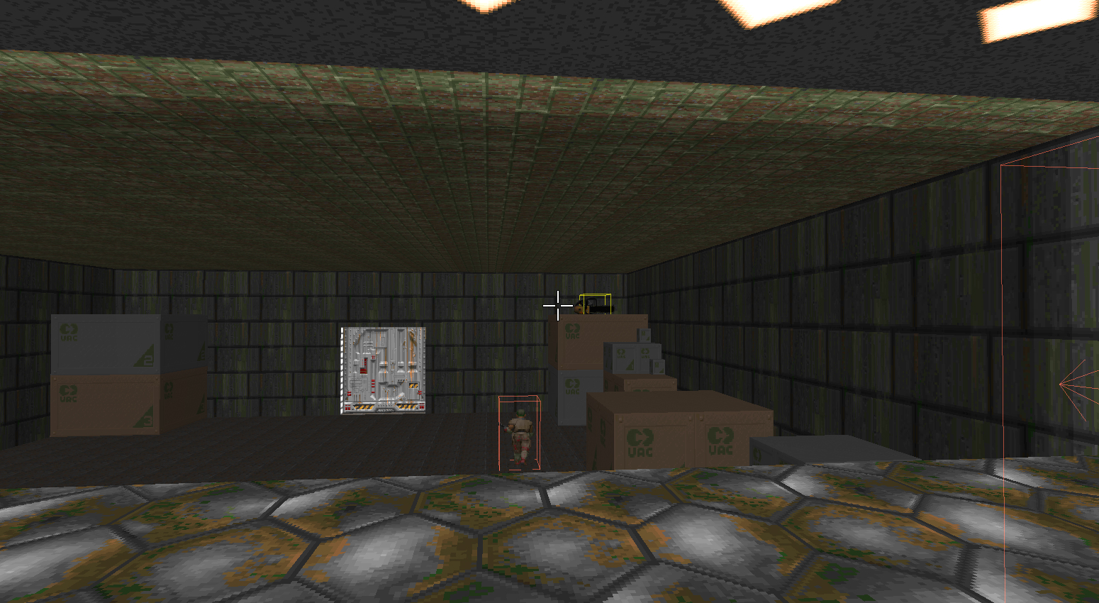
And then the last secret, a Chainsaw hidden on top of some boxes. This was an interesting one. Due to modern gaming conventions, players are used to jump mechanics in most games, FPS's like Doom included. But Doom in its original form has no jump mechanics whatsoever, and I've built this level to be compatible with the original game. And then the problem comes with the fact that Doom, when modded and run in GZDoom, has a jump button. As a result, the playtesters tried jumping from box to box until they got to the secret, which made the challenge much, much harder than I intended it to be since the boxes are rather small. Instead, if this challenge was to be faced in the old Doom fashion, it's pretty easy - instead of trying to jump, the player can just run fast enough for the momentum to carry them across the boxes. This issue came up in the disposal room as well, but since the platforms are rather large, it wasn't as bad as here. Considering that, I should have probably made the boxes somewhat larger or, even better, found a way to disable the jump mod.
The Exit
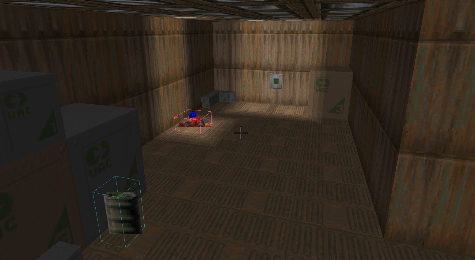
And we have finally come to the end of the level. After getting the red keycard, the exit is now unlocked, and the level can be completed.
There isn't much to talk about here, as there is nothing but a button in this room. I tried making it look like an elevator so it made sense why this room is so small. That's pretty much it.
Conclusion and lessons learned
When I started this project, I was very excited to just take the old sketch I had and build it in UDB, but I think I was rushing it too much. While I already knew the importance of pre-planning and always advocated for it, I think it was good that most of my failings happened because I didn't revise what I had and didn't properly settle down on the scope of what I was trying to build beforehand. For me, the main takeaway is that I always need to keep myself in check and revise the plan because even as defender a of planning, I fell victim to changes in scope. Now I see I should probably either have considered the narrative of the level beforehand or just built a level focused mostly on gameplay with little concern for the story, as the original Doom levels were. Still, I think this mistake has created a great opportunity to practice improvisation and creativity. There was a lot I had to adapt and think thoroughly about, and it still ended up pretty close to the original plan, which I think is great.
There were a lot of more specific lessons as well. Some of them I already knew though I hadn't experienced yet, but one that really stuck to me was the button to the secret room. It is obvious now, but I really did not expect players to prioritize searching the places they have already been for so long instead of trying to advance into the level to find what the button does. It's even more ironic how that's my own behavior when gaming and I never realized it.
Despite it all, I'm pretty satisfied with how this level turned out. It's far from perfect, but I've managed to finish it and deliver on what I planned. I'm not sure if I'm going to go back to UDB to create new levels, but if I do, there are a bunch of things I will make different. For one, I'd like to try making a less linear level, something more like actual Doom maps with a sort of central area that connects different sides of the level to make navigation smoother. Verticality is also something I'd love to use more - while Doom's engine doesn't allow for stacking floors on top of one another, I've still only used stairs and elevators once, while Doom has a lot of those.
Anyways, that'll be it for this one. This was a pretty time-consuming post, so, thanks for reading this far. See you next time!
Leave a comment
Log in with itch.io to leave a comment.